
Tips for Choosing Calm Colors for Your Home
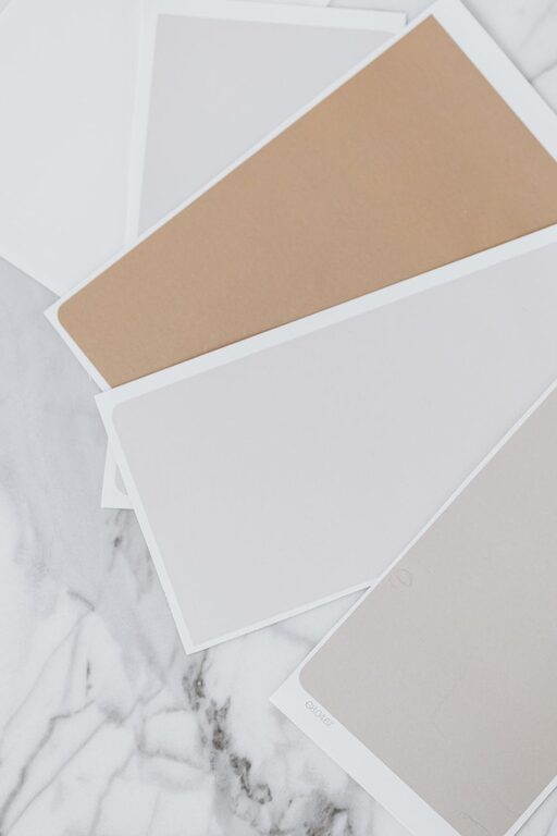
Creating a calm and welcoming environment in your home often starts with the colors you choose for your walls and decor. The right hues can help reduce stress, promote relaxation, and make your living space feel more comfortable and serene. If you’re planning to refresh your home’s color palette but want to focus on calm, tranquil tones, this guide will help you pick the perfect shades.
Why Choose Calm Colors for Your Home?
Color has a powerful impact on our mood and emotions. Calm colors are typically soft, muted, and gentle on the eyes, making them ideal for spaces where you want to unwind and recharge. Whether it’s your living room, bedroom, or even a home office, soothing colors can enhance comfort and improve the overall ambiance.
Understanding Calm Colors
Calm colors often come from the cool and neutral side of the color spectrum. Some popular calm color families include:
– Blues: Known for their soothing effect, blue shades evoke feelings of peace and stability.
– Greens: Associated with nature, greens can bring freshness and relaxation.
– Neutrals: Soft grays, beiges, and off-whites provide a subtle and balanced look.
– Pastels: Light versions of various colors, like soft pinks or lavenders, offer a gentle touch without overwhelming the senses.
Tips for Choosing Calm Colors
1. Consider the Room’s Purpose
Think about how you use the space. Bedrooms and bathrooms often benefit from cooler, restful tones like soft blues or greens. Living rooms might work well with warm neutrals or pale grays that invite conversation without overstimulation.
2. Test Colors in Different Lighting
Natural and artificial light can change how colors appear. Paint small sections of your wall and observe them at different times of day. This will help you understand how the color shifts and whether it maintains its calming feel in various lighting conditions.
3. Use Color Samples
Purchase paint samples or swatches and bring them into the space. Compare them against your furniture, flooring, and other decor elements. Calm color schemes should complement rather than clash with existing items.
4. Keep it Soft and Muted
Avoid overly bright or saturated colors if your goal is calmness. Muted tones tend to be more relaxing and less visually demanding. For example, instead of a bright turquoise, consider a soft teal.
5. Consider Color Combinations
Pairing calm colors can enhance the tranquil effect. Some safe combinations include:
– Light blue with soft gray
– Pale green with creamy beige
– Muted lavender with off-white
Using two or three complementary calming colors creates depth and harmony without becoming dull.
6. Incorporate Natural Elements
Colors inspired by nature often have a calming effect. Think about sandy beiges, leafy greens, or sky blues. These shades remind us of the outdoors and can create a peaceful atmosphere indoors.
Additional Tips to Enhance Calmness
– Add Textures: Soft fabrics, woven rugs, and wood accents can enhance the feeling of warmth and relaxation alongside calm hues.
– Limit Strong Contrasts: Stark contrasts can be visually jarring. Stick to gentle variations within your chosen color palette.
– Use Accents Wisely: If you want to introduce a pop of color, use it sparingly on throw pillows, art, or small decor items to maintain balance.
– Maintain Clean Lines: A tidy, uncluttered space complements calm colors and helps avoid distractions.
Popular Calm Colors for Inspiration
Here are some widely loved calm paint colors to consider for your home:
– Pale Blue: Often reminiscent of a clear sky, pale blue can make rooms feel open and peaceful.
– Sage Green: A muted green that brings in natural vibes without overpowering.
– Soft Gray: Neutral and versatile, soft gray pairs well with many accents.
– Warm Beige: A cozy neutral that adds subtle warmth to any room.
– Lavender Mist: A gentle purple tone that soothes and adds a touch of elegance.
Final Thoughts
Choosing calm colors for your home is an excellent way to create a welcoming and restful environment. By considering your room’s function, testing colors in different lights, and sticking with muted, nature-inspired hues, you can design a space that truly feels like your peaceful retreat.
Remember, color is personal, so take your time experimenting with different options until you find the ones that make you feel most at ease. Your home should be a reflection of your comfort and style, and calm colors are a wonderful tool to achieve just that.
Related Post
How to Create a Cozy Coffee Station at Home
Discover simple steps to set up a personalized coffee station at home, making your daily [...]